How to Use Gephi to Analyze Social Network Data for Beginners

In this post, I will introduce you to Gephi and show you how you can use it to analyze social network data.
This post assumes that you do not have any familiarity with Gephi.
What is Gephi
Gephi is a powerful open-source software for exploring and manipulating networks. As an open-source software, its code is available to be forked from its GitHub repository and extended by other developers. Many independent developers have been extending Gephi’s functionality by creating third-party plugins that give Gephi the ability to perform many tasks, such as streaming Twitter data, interacting with Neo4j, and fetching data from an Oracle database to mention a few.
Gephi is a popular software choice among social scientists, researchers, educators, and data scientists because of its ease of use. With a point-and-click interface, you can easily run powerful algorithms to help you analyze your data and can also manipulate the appearance of your network graph with the aid of a variety of layout algorithms as well. We will see these in action as we go on in this post.
To use Gephi, it needs to be installed on your computer. So, if you do not have Gephi already installed on your computer, visit gephi.org to download and install the latest version of Gephi on your computer.
Gephi Dataset Formats
Gephi accepts different dataset formats, such as CSV, GraphML, and GEXF. Now, if you are loading data as a CSV, you will need to have two different CSV files, with one containing the nodes and the other containing the edges.
In this example, we will be using the CSV file format to load data into Gephi. The dataset we will use is of the conversations about Doge coin on Twitter prior to the Elon Musk era. You can download the nodes and edges CSV files at the GephiDatasets GitHub repository, which is an independently managed repository without any direct affiliations to Gephi.
The files are labelled “dogeNodes” and “dogeEdges”. Download them so that you can follow along.
Now, very importantly, you will need to pay attention to the column headers of your dataset. Node CSV files should have the following default columns with the headers, “Id”, “Nodes”, “Label”. You can include other columns too such as node attributes or a time element for dynamic network analysis as shown in the image below.

The edges CSV files, on the other hand, typically have the columns “Source”, “Target”, “Type”, and “Weight” as illustrated below

You would notice that the Source and Target data are numbers instead of characters. This is because the names of each node in the network has been replaced by its Id. That is the way Gephi is able to map the relationships or connections between nodes. Some other network analysis tools make use of a matrix to map relationships.
If you are not using a pre-formatted dataset like this one, you will need to replace each node's name with its Id in the edges dataset. With a simple R or Python program, that can easily be done.
The “Type” column tells Gephi the kind of network graph we want to draw. “directed” means we are mapping a one-way relationship i.e. the connection comes from one node to the other. The opposite of this is “undirected”, which is a two-way connection.
“Weight” is a measure to determine the frequency of interaction between two nodes. In a network graph, edge connections that are thick means that they have a high weight, implying that the two nodes interacted a lot with each other in the network.
Let us now load the datasets into Gephi.
Start Gephi
Start Gephi by double-clicking on the icon on your desktop. You should see an interface that looks like this

Click “New Project”. You will now be shown a blank canvas. The next thing you want to do is to import your nodes and edges datasets.
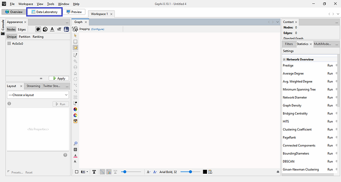
To do so, go to the “Data Laboratory” tab and click it. It is highlighted with the blue rectangle in the image below
When you enter the Data Laboratory, you will find empty Nodes and Edges field. By default, “Nodes” is selected. Make sure to import your nodes dataset before you import the edges; afterall, persons exist before relationships.
Next, click “Import Spreadsheet” and select the nodes CSV file. You should see the window below
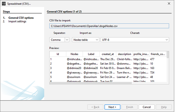
Click “Next”, then click “Finish”. If all goes well, you should see the number of nodes that are in your network dataset. Leave everything as-is and click “OK”. You will then see your dataset loaded into the Data Laboratory.
Now, we will follow the same steps to import the edges. First, select the edges tab in the Data Laboratory to show you the blank edges field. Then click on “Import Spreadsheet” and select the edges CSV file. Click “Next” then “Finish”. You should see the image below

Now, very crucially, make sure you select “Append to existing workspace” before you click “OK”, otherwise, the edges won’t be appended to your nodes, and you will end up with a useless graph.
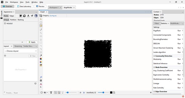
Again, if all goes well, you should now see your graph as depicted in the image below
Analyzing the Graph
Let us now begin to analyze this graph by running some algorithms. To the right of your workspace, click the “Statistics” tab. You will see metrics you can run to give you insight about your graph. One metric I like to run first is “Modularity”, which identifies distinct groupings or communities in a network. Running it will show you how many communities have been detected in your graph.
I also like to know how dense or sparse a network graph is by running the “Graph Density” metric, which calculates the level of connected edges in the network divided by the total number of possible connections where every single node is connected to every other node. A density score closer to 1 means the network graph is dense, but a score closer 0 means the network is sparse.
You can also run the “Network Diameter” metric. This will tell you the distance between the two farthermost nodes in the network. Another good metric to run is “Avg. Path Length”. This will tell you how long it will take to traverse the network. Usually, if the network is sparse (a density score closer to 0), you will have a high average path score, which means it will take longer to traverse the entire network.
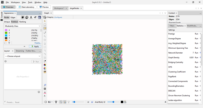
Having run the Modularity metric, we can now color the graph by the detected communities. Therefore, go to the left-hand side of your workspace. Under “Nodes”, you will see 3 tabs, namely “Unique”, “Partition”, and “Ranking”. Click “Partition”, and from the dropdown menu, select “Modularity Class”, then click “Apply”. You will immediately notice that your graph has been colored
Nice! However, the graph still doesn’t tell any story because we still can’t make out the communities in the network. To fix that, we will run layout algorithms to make our graph easier to comprehend. My go-to algorithm is Fruchterman Reingold algorithm, which makes the communities very visible. To run it, look down to the “Layout” tab. Click it, and from the resulting dropdown menu, select Fruchterman Reingold. Unless you know what you are doing, you may leave the parameters as-is and run it.
It may take some time to finish running, because the nodes are being pulled to their respective clusters or communities. When the process is done, the algorithm will stop running. Alternatively, you can manually stop it if you are satisfied with the quality of the output.
Your graph will look something like this after running the algorithm
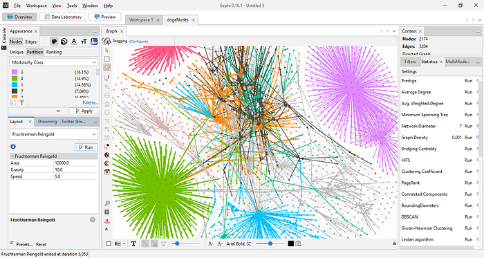
Now, the communities in the network are easier to see. You may also run the “Noverlap” layout algorithm to remove overlaps in the network.
Let us now learn some information about the nodes in the network. For example, we would like to know which nodes are the most influential in the conversations. Influence here is measured by who is the go-to person in the conversation i.e. who is the most retweeted, mentioned, quoted, or replied to in the network. We would like to make the size of the influential node bigger than the others so that they are readily visible as influencers.
Therefore, click the icon highlighted in the green square in the image below
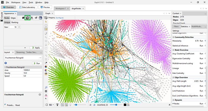
Click “Ranking”. In the resulting dropdown menu, select “In-Degree”. Give a Min size of 10 and a Max size of 60 and click “Run”. The moment you do that, you will notice that the central nodes are now more visible. You can play around with these parameters to size the nodes in your graph. There are also other kinds of information you can learn about the nodes in the network, such as who retweeted, mentioned, quoted, or replied to others the most. You can know this by selecting “Out-Degree” and sizing the nodes accordingly.
You can know who particular nodes are by right-clicking on them in the graph and choosing the “select in data laboratory” option. Thereafter, go to the Data Laboratory, and you will see the node highlighted in the table.
Preview and Export Graph Image
To preview your graph, click the “Preview” tab above. It will display a blank canvas with some settings in the left pane. Simply go down, and hit “Refresh” and you will see a nice-looking display of your graph image.
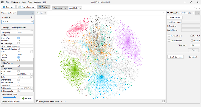
There are tweaks you can make to this image before exporting it, such as making the edges straight instead of curved, removing the edges entirely, making the nodes and edges thicker in appearance, and making the node labels appear on top of the graph. You can also change the background color of the graph.
Finally, you can export the graph as either an SVG, PDF, or PNG file by clicking “Export” at the bottom of the left pane. I prefer exporting as a PNG file so that I can easily share the image with others on social media. 😃
And that is how to use Gephi to analyze data. This has merely scratched the surface of how to use Gephi. This article is intended to get you started with using Gephi for your social network analysis projects.
There are many other helpful resources online that you can use in your Gephi learning journey. You can also consider joining the Gephi Facebook group where people ask questions, share opinions, projects, and offer help to learners.
I hope you enjoyed reading this post!
Follow me on Medium: @ifeanyidiaye
Follow me on Twitter: @Ifeanyidiaye
You can read my other articles on Medium here:
How to Deploy an R Shiny App as a Hugging Face Space | by Ifeanyi Idiaye | Jun, 2023 | Medium